

CSS Box Model
When laying out a document, the browser’s rendering engine represents each element as a rectangular box according to the standard CSS basic box model.
The CSS box model describes the rectangular boxes that are generated for elements in the document tree.
The CSS box model is essentially a box that wraps around every HTML element. It consists of:
- margins
- borders
- padding and
- content
The image below illustrates the box model:

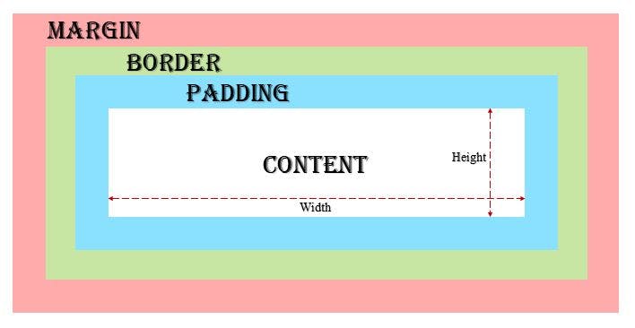
Content : Content area, bounded by the content edge, contains the “real” content of the element like text, image, or other media content.
Padding : Padding area, bounded by the padding edge, is the space around an element’s content, inside of any defined borders.
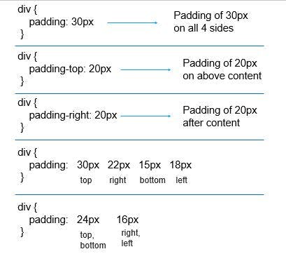
The thickness of padding is determined by the properties such as:
- padding : padding on all 4 sides
- padding-top
- padding-right
- padding-bottom
- padding-left

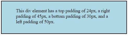
Example :
This will produce the following result −

Border : A border that goes around the padding and content.
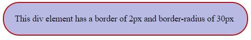
Example :
This will produce the following result −

Margin : The margin area, bounded by the margin edge, extends the border area to include an empty area used to separate the element from its neighbors.
The margin edge surrounds the box margin. It clears an area outside the border.
The padding is determined by the properties such as:
- margin : margin on all 4 sides
- margin-top
- margin-right
- margin-bottom
- margin-left
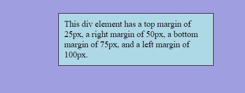
Example :
This will produce the following result −

WIDTH, HEIGHT & BOX - SIZING
The width and height properties are used to set the width and height of an element.
The width and height properties do not include padding, borders, or margins. It includes just the width and height of content area.
But by default, width & height must be calculated as:
actual width of element = width of content area + padding + border
actual width of element = width of content area + padding + border
Hence, to overcome this problem, we use box-sizing property as border-box.
Box-Sizing :
The CSS box-sizing property allows us to include the padding and border in an element’s total width and height.
If you set box-sizing: border-box; on an element, padding and border are included in the width and height.
The box model follows these principles:
- CSS calculates the width of elements by adding the width, padding and border together.
- CSS calculates the height of elements by adding the height, padding and border together.
As a result, developers need to adjust values when setting width and height to leave space for borders and padding.
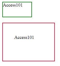
Example 1 :
Below example is having same width and height of two element but giving result is different, because second one is included padding property.
This will produce the following result −

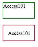
Example 2 :
Below elements are having same height and width withbox-sizing:border-box so result is always same for both elements.
This will produce the following result −

Note : Instead of declaring box-sizing: border-box; for every element, we can declare only once for whole document using universal selector like:
In the above example, margin & padding is set to 0 initially since every element in the document will be having default margin & padding.