Measuring Units :
we use length in width, height, margin, padding, font-size. There are two type of units in css .
- Absolute
- Relative
Absolute Units :
They are not relative to anything else, and are generally considered to always be the same size. The only value that you will commonly use is px (pixels).
- px(1inch = 96px)
- pt(1inch = 72pt)
- pc(1inch = 12pt)
Relative Units :
Relative length units are relative to something else, perhaps the size of the parent element’s font, or the size of the viewport.
- em- It is relatvie to the size of direct parent. It is multiplier of direct parent element
- rem- It is relative to the root of the HTML element. It is multiplier of root element
- vh- 1% of viewport height(Viewport = the browser window size)
- vw- 1% of viewport width(Viewport = the browser window size)
- %- relative to parent
Example:
HTML
CSS
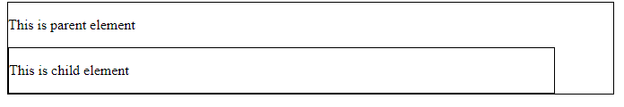
- Example of measurement unit in pixels
This will produce the following result −

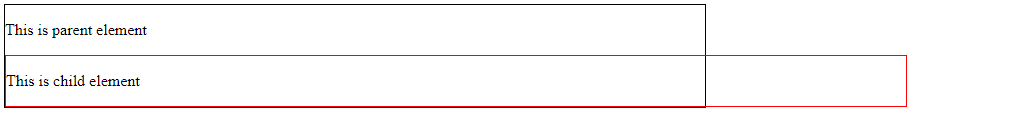
- Example of measurement unit in em
This will produce the following result −

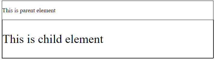
- Example of measurement unit in rem
This will produce the following result −

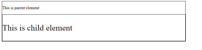
- Example of measurement unit in percentage
This will produce the following result −